Commercial Branding: Make Your Space Stand Out in 2026
A complete guide to commercial branding for interiors—strategy, mockups, UV wall printing, murals, and maintenance—built for Ontario teams and multi-site rollouts.
Commercial branding is the strategic use of visuals, voice, and in-space experiences to shape how people perceive a business. In Ontario and the local area we serve across Canada, it turns interior walls into brand assets that guide emotion and behavior. With direct-to-wall printing and murals, spaces communicate identity fast.
By Ink Blend • Last updated: 2026-06-18
Overview and Table of Contents
This complete guide shows how commercial branding translates into real spaces using UV wall printing, custom murals, and surface graphics. You’ll see strategy-to-execution steps, proven best practices, and tools. We include real scenarios from restaurants, retail, offices, hotels, condos, and cultural venues for on-the-ground clarity.
Branding succeeds when your environment tells a clear story within seconds. We focus on interiors because walls carry weight: they set tone at entry, shape flow, and become shareable backdrops. In our studio practice, we translate brand systems into crisp, durable, and photo-ready features that align with daily operations.
- What commercial branding means for interiors (clear definitions)
- Why cohesive spaces drive recognition, trust, and action
- How on-site UV wall printing and murals work, step-by-step
- Methods compared: UV print vs vinyl vs paint vs panels
- Design and production best practices that scale
- Tools, checklists, and approval workflows you can use
- Case studies from hospitality, retail, offices, and culture
Quick Summary
Commercial branding turns interiors into high-impact touchpoints. With direct-to-wall UV printing and custom murals, you get 4K detail, durable finishes, and design freedom. The fastest path: photos and measurements, mockups for approval, then a coordinated on-site print day that reveals a polished, on-brand feature wall.
Ink Blend helps organizations transform blank walls into clear, memorable experiences. Our studio specializes in UV wall printing, custom wall murals, and large-format surface graphics. We emphasize mockups and approvals—so teams can validate color, scale, and legibility before anything touches the wall.
What Is Commercial Branding?
Commercial branding is the cohesive system of visuals, messaging, and experiences that communicate a company’s identity. In physical spaces, it shows up as logos, type, color, imagery, textures, and materials that align touchpoints—from reception walls and culture displays to dining rooms and retail features.
Think of your environment as a three-dimensional brand guide. Colors reinforce category and mood. Typography shapes tone—technical, warm, refined, playful. Imagery defines story. Materials influence perceived quality. When these choices repeat consistently across surfaces, customers “read” who you are in a glance.
On-site execution matters just as much as design intent. That’s why we prioritize accurate scale, color-managed production, and durable finishes. For clients in restaurants, retail, workplaces, and hospitality, this blend of clarity and craft is how interiors become productive brand assets—day one and year two.
Why Commercial Branding Matters
Branded interiors speed recognition and build trust. Clear cues—color, typography, icons—help visitors navigate, remember, and share your space. A strong hero wall becomes a daily photo backdrop. When teams and customers see consistency across touchpoints, the whole experience feels reliable and intentional.
Here’s the thing: people form impressions fast. Your entry wall often sets expectations in under a few seconds. A concise palette, a readable typographic lockup, and a focused visual motif do more than decorate—they signal professionalism and care. That signal affects dwell time, wayfinding, and word-of-mouth.
- Recognition: Repeated elements train recall. Expect faster brand pickup when your visual language is clear and consistent across surfaces.
- Wayfinding: Wall features and color blocking help visitors find counters, product zones, and meeting rooms without confusion.
- Shareability: A camera-ready feature wall gives customers a reason to post, tag, and extend your reach beyond the room.
- Culture alignment: Internal teams bond to a visible mission when values appear in daily sightlines.
We’ve seen feature walls become the most photographed spot in a venue within days of installation. That organic exposure is durable; it compounds with every visit and post, especially when the backdrop carries signature brand elements tastefully.
How Commercial Branding Works in Physical Spaces
Great branded interiors align three layers: strategy, design, and execution. Strategy defines goals and audience, design translates them into visuals, and execution makes it real with methods like direct-to-wall UV printing, murals, vinyl, and panels—selected for texture, durability, and speed.
1) Plan with clear inputs
- Collect wall photos (front-on and angled), width × height, and obstruction notes (outlets, lights, shelves).
- Map sightlines: entry points, first-glance zones, dwell areas, and photo moments.
- Clarify purpose: attract attention, reassure quality, educate, or entertain.
- Prepare assets: logo vectors, color values, brand textures, and high-res images.
2) Translate brand to walls
- Right-size type for distance. As a practical rule, 1 inch of letter height per ~10 feet of viewing distance improves legibility.
- Target 150–300 DPI at final scale for photography and patterns to maintain crispness.
- Use mockups to preview scale, contrast, and interaction with architecture.
- Plan for lighting: indirect glare can wash out dark tones; test swatches on-site.
3) Execute with the right method
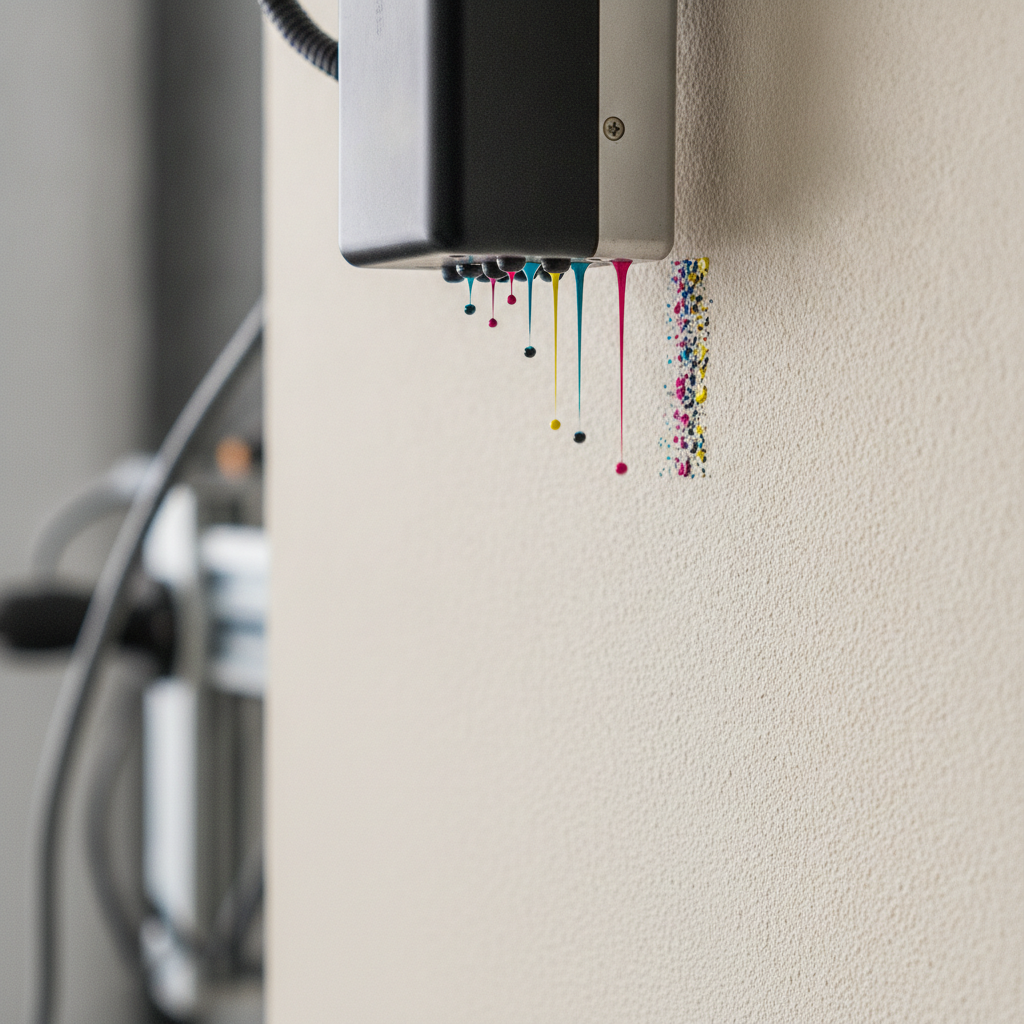
- Direct-to-wall UV printing: Ultra-crisp edges and 4K artwork detail, ideal for logos, type, fine patterns, and photography.
- Custom murals: Painted or hybrid approaches for illustrative, tactile results.
- Surface graphics: Vinyl and rigid panels for wayfinding, accents, or protective layers in high-touch zones.
Our coordinated workflow reduces disruption: floor protection, clean masking, and a tidy on-site path. Paint cure times matter—many interior paints need a cure window before printing for optimal adhesion. A simple pre-print checklist keeps the day smooth and the finish sharp.
Types and Methods for On‑Site Brand Expression
Choose your method based on scale, texture, longevity, and creative direction. UV wall printing excels at crisp detail and speed. Painted murals deliver craft and texture. Vinyl and panels add dimensionality and quick swaps. Mix methods by zone without diluting your identity.
Method Best For Durability Detail Install Speed Direct-to-wall UV Logos, fine patterns, photography High Very High Fast Painted mural Illustration, artistic texture High Medium–High Moderate Vinyl graphics Wayfinding, seasonal updates Medium High Fast Rigid panels Dimensional signage, accents High High ModerateDirect-to-surface UV printing is a refined wallpaper alternative when you need custom scale and lasting color on prepared interior walls. For reception statements, retail identity walls, and restaurant focal points, UV delivers precision with minimal downtime—type stays razor-sharp and photography holds its tone.
Best Practices for Branded Interiors
Anchor the experience with one hero wall, keep contrast readable, and size type for real viewing distances. Validate scale with mockups, and align materials to traffic levels. Document brand elements so multi-site rollouts stay consistent without endless rework.
Design rules that hold up
- One hero, many supports: Give people a single focal wall, then echo motifs on secondary surfaces.
- Contrast that reads: Aim for strong light/dark separation so headlines and wayfinding remain legible under varied lighting.
- Texture-aware art: If walls have texture, avoid hairline strokes and ultra-thin serifs.
- Sightline testing: Preview designs from seated and standing positions; adjust crop and leading accordingly.
Production choices that last
- Use vector type and 4K imagery to avoid fuzzy edges at scale.
- Select finishes that withstand routine cleaning in hospitality and retail.
- Protect edges and high-touch corners with panels or guards when needed.
- Document ink sets, color builds, and finish notes for future refreshes.
Mockups dramatically reduce avoidable changes. When stakeholders see real-world scale and color relationships before print, approvals speed up and confidence rises. That’s why our projects flow from concept boards to annotated visuals, then onto the wall.
Tools and Resources for a Smooth Project
A simple toolkit—photos, measurements, floor plan, and brand files—can cut weeks from your timeline. Add scaled mockups, a pre-print punch list, and a single point of contact. With those basics, on-site days run cleanly and reveals land on-brand.
- Wall intake checklist: wide and angled photos, width × height, outlet/fixture map, and notes on texture/paint age.
- Brand assets: logo vectors, color values, typography files, approved imagery and rights.
- Mockup workflow: scaled overlays with notes for sightlines, lighting, and viewing distance.
- Site coordination: access windows, floor protection, and paint cure confirmation.
For brand teams, a consistent playbook saves time across locations. See our guidance on what to send for a quote to kick off quickly. If you’re weighing methods, our UV print vs. wallpaper comparison breaks down durability, detail, and maintenance in practical terms.
Local considerations for your area
- In the GTA’s busiest venues, schedule installs outside rush periods to minimize disruption for staff and guests.
- Winter humidity swings can affect substrates; confirm paint cure windows before printing to ensure proper adhesion.
- For multi-site rollouts across Ontario, standardize palettes and typography so each location matches with minimal revisions.
Free visual check: Send wall photos and rough dimensions. We’ll flag any surface prep needs and suggest hero-wall options that align with your brand system.
Explore our commercial branding service to see methods and workflow details.
Step-by-Step: From Photo to Printed Wall
The fastest route to a branded interior is simple: capture photos and measurements, approve a scaled mockup, confirm site prep, then print directly on the wall. This four-step path keeps decisions clear and the on-site day efficient.
- Discovery: Share wall photos, width × height, and a brief on goals, audience, and tone. Note obstacles and lighting.
- Concept + mockup: We translate your brand assets into options at true scale. You approve placement, size, and contrast.
- Site prep: Confirm paint cure and surface readiness; plan protection for floors and fixtures; set access windows.
- On-site print: Direct-to-wall UV printing for crisp edges and consistent color; tidy footprint; same-day reveal for single walls.
That’s our polished workflow in action. It’s how we deliver organized, high-finish installations for restaurants, salons, offices, hotels, condos, and cultural spaces without prolonged closures or guesswork.
Measurement and Scale Guide for Wall Branding
Scale makes or breaks legibility. Use simple heuristics: 1 inch of letter height per ~10 feet of viewing distance, 150–300 DPI at final size, and strong light/dark contrast. Test with mockups from seated and standing views to validate real-world readability.
- Viewing distance: Map primary views (6–12 ft for counters; 12–25 ft for lobbies) and size type accordingly.
- Resolution: Keep vector type; prep photography/patterns for 150–300 DPI at print size to avoid softness.
- Contrast: Favor bold separation between type and background; avoid low-contrast pairings in dim areas.
- Texture: Coarse surfaces can swallow thin lines; increase stroke weight and tracking slightly.
In our experience, spending 20 minutes with measurements and a quick scale test saves hours later. It also prevents brand dilution across locations by locking in a repeatable sizing logic.
Maintenance and Longevity in Busy Spaces
UV-cured inks form a tough finish that resists everyday scuffs and wipe-downs. Pair them with sound site prep—clean surfaces, proper cure windows—and you’ll get a durable, easy-to-maintain brand feature that stands up to hospitality and retail traffic.
Brands live in the real world: carts bump walls, chairs scrape, and cleaners do quick turnarounds. We plan for it. UV finishes are built for frequent touch and routine cleaning. In high-contact zones, we’ll often introduce protective trims or panels that carry your palette without sacrificing durability.
- Cleaning: Plan a regular wipe schedule compatible with your finish; spot-test new products first.
- Edges/corners: Use guards or trims where carts and chairs meet walls most often.
- Refresh logic: Document files and color data so seasonal updates and multi-site refreshes remain consistent.
Good maintenance isn’t complex—it’s planned. With a simple schedule and a record of brand assets, your hero features keep delivering impact long after opening week.
Case Studies and Examples from Our Work
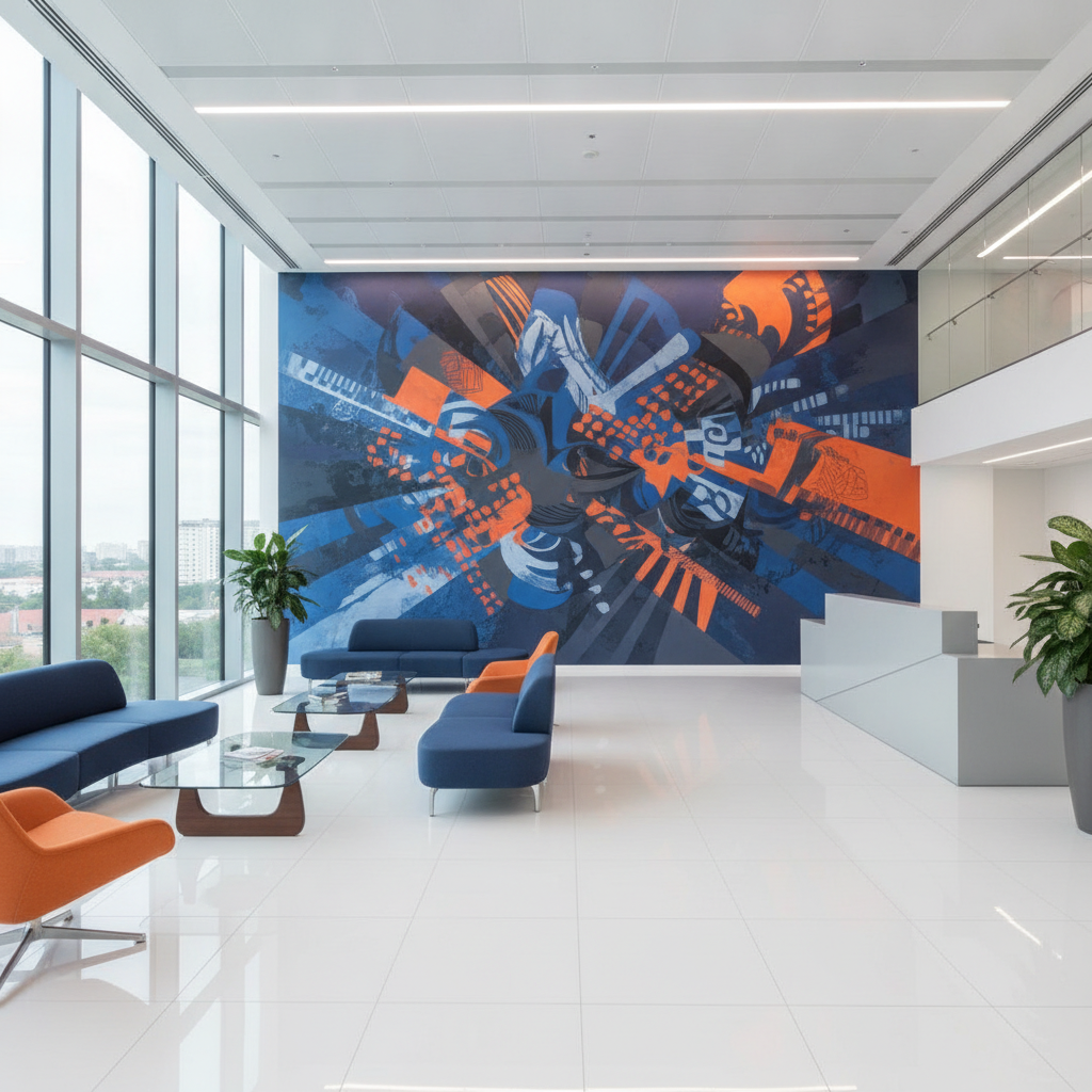
Across hospitality, retail, offices, and cultural spaces, UV wall printing and murals turn ordinary rooms into memorable experiences. Feature walls spur photos, reception statements set tone instantly, and culture walls align teams daily—all with durable, easy-to-maintain finishes.
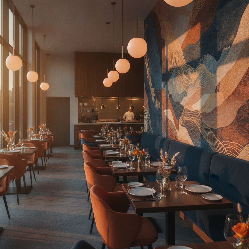
Restaurant and café feature walls
A cafe requested a warm, photo-friendly backdrop that matched their palette. We mocked up two scales, validated sightlines from the dining area, then printed a 4K pattern behind the service counter. Staff now direct guests to the wall for consistent, on-brand photos—simple and effective.
Office reception statements
For a corporate lobby, we used direct-to-wall UV printing to render a crisp typographic lockup with subtle brand textures. Visitors caught the mark within seconds of entry. The hero wall set the tone for the rest of the workplace, echoed in meeting rooms and culture corridors.
Retail identity walls and salon backdrops
Salons and boutiques need backdrops that feel premium under bright lighting. We aligned color builds to their brand guide, tightened line weights for texture, and placed motifs where cameras naturally point. The result? A repeatable, social-friendly identity wall that elevates the customer experience.
Hotels, condos, and cultural spaces
Large lobbies and long corridors benefit from scale logic and durable finishes. We combine UV printing with accent panels where needed—delivering depth, wayfinding clarity, and a finish that keeps its edge under daily traffic and cleaning cycles.
Methods Compared and When to Use Each
Use UV printing for precision and speed; choose painted murals for handcrafted texture; apply vinyl for wayfinding or seasonal updates; and add rigid panels for dimensional emphasis and protection in high-touch areas. Many spaces blend methods by zone to optimize results.
- UV printing: Reception statements, detailed logos, fine patterns, and photo features.
- Painted murals: Illustration-led walls, artistic concepts, and textured aesthetics.
- Vinyl graphics: Directional systems, seasonal campaigns, and quick swaps.
- Panels/installs: Edges, corners, and dimensional brand elements.
Curious how this plays out in restaurants? Explore our restaurant wall branding ideas and see which method fits your layout and service model.
Brand Consistency Across Locations
Multi-site rollouts stay on-brand with a shared playbook: a palette and type kit, a hero-wall template, scale rules, and a file handoff folder. Lock these in once, then apply them to each location with minor tuning for architecture and lighting.
- Palette + type kit: Keep color values and fonts centralized with version control.
- Hero-wall template: A reusable layout for reception or feature zones speeds approvals.
- Scale rules: Standardize headline sizes by viewing distance to avoid ad-hoc choices.
- File handoff: Store vectors, linked images, and notes in a shared folder for partners.
For interior designers and facility teams, consistency is time saved. Our interior design graphics support is built to help spec projects cleanly with repeatable outcomes.
Tools for Marketing Teams and Designers
A short toolkit drives consistency: a style guide distilled for walls, sightline mockups, a measurement worksheet, and a content calendar for seasonal refreshes. With these in place, each update becomes a routine play—fast, accurate, and on-brand.
- Wall-focused style guide: Translate brand guidelines into sizing, contrast, and material notes.
- Mockup templates: Pre-sized frames for common wall dimensions standardize scale checks.
- Measurement worksheet: A simple form prevents missing dimensions and speeds quoting.
- Refresh calendar: Align seasonal visuals without drifting from core identity.
For practical tips on visual consistency, see these insights on branding your visual marketing. Use them to align photography, color, and composition choices across channels and in-space features.
Surface Preparation Essentials
Great prints start with sound surfaces. Confirm paint cure windows, clean and dust walls, and identify textures that may affect fine detail. A 15-minute inspection and quick prep checklist remove surprises and protect finish quality.
- Clean and inspect: Remove dust; check for flaking or glossy patches that can affect adhesion.
- Confirm cure: Fresh paint often needs a cure period before printing for best results.
- Note texture: Coarser textures require heavier line weights and contrast.
For a general prep refresher, review a practical wall prep checklist and adapt relevant steps for direct-to-wall printing. Our team will also flag any site-specific prep in your intake review.
When to Choose UV Printing vs. Alternatives
Choose UV printing when your brand needs precision, longevity, and fast on-site work. Opt for murals when texture and craft lead the story. Use vinyl for swift changes and wayfinding. Blend methods to match zones, traffic, and refresh cadence without diluting identity.
If you’re evaluating options for a reception or feature wall, compare practical pros and trade-offs in our studio’s perspective on UV printing vs wallpaper. You’ll see how detail, durability, and cleanup differ in daily operations.
Commercial Branding FAQ
Commercial branding blends strategy with execution. The answers below address common questions on surfaces, approvals, on-site timelines, and durability so you can move from idea to print day with confidence.
What surfaces can you print on directly?
Prepared interior walls, sealed drywall, primed plaster, select tiles, and certain panels work well for direct-to-wall UV printing. We assess texture, porosity, and paint cure during intake to confirm adhesion and finish quality.
How do we approve scale before printing?
We create visual mockups from your wall photos and measurements. You’ll review typography size, logo placement, and sightlines. Once approved, we print at 1:1 scale on-site so what you saw is what you get.
Is UV wall printing durable in busy spaces?
Yes. UV-cured inks create a tough finish that resists scuffs and routine cleaning. It’s ideal for hospitality, retail, and workplaces where walls see frequent contact and need to stay sharp over time.
How long does a typical on-site day take?
Most single-wall prints are completed within a coordinated day, depending on access windows, wall size, and complexity. Multi-wall or multi-site projects are sequenced with a shared playbook for consistent brand execution.
Key Takeaways and Next Steps
Start with photos and measurements, align on a hero wall, and approve a scaled mockup. Schedule a coordinated on-site print, and document your palette, type, and sizing logic for future updates. That’s how branded interiors stay sharp and consistent.
- Key takeaways: one hero wall, strong contrast, sizing by distance, 4K art, and a clean, well-planned on-site day.
- Next step: gather wall photos and rough dimensions so we can prepare a fast visual mockup and approval path.
- Explore UV wall printing and custom murals for your space, or view our commercial branding service overview.
- For multi-site teams, align with our feature wall templates to streamline approvals.
References and Inspiration
Solidify your playbook with practical guides on visual consistency and brand systems. Translate insights from digital into the built environment, then validate with scaled mockups before print day.
For deeper brand-system thinking, this overview of brand identity elements pairs well with our in-space approach. Use it alongside in-house guidelines to keep channels and interiors moving in lockstep.